
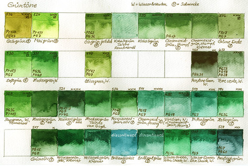
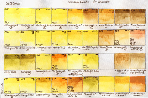

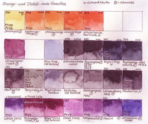
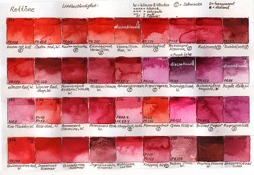

I had the idea to make a chart of all the colours I posess to get an overall view of them. I don't use them all; sometimes I use some of them and a month later, I substitute them again with others. - I was interested in making a note of the lightfastness and the pigments used. It was quite a lot of work.
I didn't use the lightfastness notes of the corresponding manufacturer, but made a new evaluation to get an overall view of the lightfastness of the different colours to have the possibility to compare each other.
The best lightfastness was marked with four asterisks, three asterisks mean very good lightfastness; two mean good lightfastness and "0!" means that the colour is not lightfast and should be avoided (f.e. Alizarin Crimson). At the upper left, I noted the number of the corresponding colour chart. At the lower left, you can find the international abbreviation of the pigments used in the colour.
Here is a list of the manufacturer of the colours:
1. Winsor & Newton (W.)
2. Schmincke (S)
3. Lukas
4. Kremer
5. Old Holland
6. Talens Rembrandt
and 7. Ferrario-Tintoretto
Ich hatte die Idee, eine Tabelle aller meiner Aquarellfarben anzulegen, um eine gewisse Übersicht zu bekommen. Ich verwende sie natürlich nicht alle, manchmal benutze ich einige, um sie einen Monat später wieder durch andere zu ersetzten. Ich wollte auch den Grad der Lichtechtheit notieren und die Pigmente, die für die Herstellung der einzelnen Farben verwendet wurden.
Ich habe nicht die Lichtechtheits-Markierungen der einzelnen Hersteller übernommen; sondern sie in eine neueTabelle überführt, die es erlaubt, die einzelen Farben in ihrer Lichtechtheit ungefähr zu vergleichen.
Die beste Lichtechtheit bekam vier Sternchen, eine sehr gute immerhin drei; zwei Sternchen stehen für gute Lichtechtheit und "0!" für Farben, die nicht lichtecht sind und die man vermeiden sollte (z.B. Alizarin Crimson).
Oben links notierte ich die Farbnummer der jeweiligen Farbkarte.
Unten links steht die internationale Abkürzung der Pigmente, die für die Herstellung der Farbe benutzt wurden.
Die Herstellerliste ist folgende:
1. Winsor & Newton
2. Schmincke
3. Lukas
4. Kremer
5. Old Holland
6. Talens -Rembrandt
und 7. Ferrario - Tintoretto.
(Die einzelnen Links der Hersteller kann man oben im englischsprachigen Teil anklicken).


6 comments:
You have a great collection of charts and colors. I keep my charts by manufacturer, but only because I started with one manufacturer and have added others over time. With only two or three of mine with low lightfastness, the colors have a notation of "don't use". Charts do take a lot of time to make, but they make a wonderful reference.
i was supposed to have done these last year. having failed it's got put on to this years list. seeing your work has inspired me to work on mine sooner than later :D
What an amazing exercise. I usually get art class members to do a short exercise with wheels just using three different primaries and encourage them to do more with other primaries in their own time. .. but this must have taken ages with all your analysis. I still have my watercolour sketchbook with my colour charts in from years ago. Its still very useful but yours look beautiful as well. You must have had a good system to keeping it all so fresh and clean.
The charts are really beautiful like little pieces of art. I like to do a sample sheet with new crayons or paints, never as neat as yours. Thankyou for sharing them, they are so lovely and colourful.
What a great exercise! Thanks for sharing it! I want to also wish you Un felice dia de San Valentine!!! abrazos y besitos de chocolate!
I love painting colour charts, Claudia. So satisfying and usually the only time I get to use most of my colours. Yours are beautiful.
And thanks to your post I don't have to feel so guilty about the number of tubes of watercolour I have. ;)
Post a Comment